 CMT had the rare and interesting opportunity to tour a selection of MetroBus and MetroLink stations with a group of Metro managers to assess the facilities from a user’s perspective. The tour was organized by Ray Friem, Metro’s Chief Operating Officer, for his direct reports. The goal of the tour was to bring all departments that oversee a piece of the users’ experience together to identify the work that needs done at the stations, to help identify the priorities, and to coordinate different departments responsible.
Apparently, the simple act of placing a sign anywhere on the system touches a range of departments, and when one sign isn’t a priority for every one of the departments, the solutions to customer experiences sometimes take longer than expected.
So, in an effort to focus and streamline efforts, they went out and assessed the stations. The departments represented included marketing, planning, security, MetroLink operations, MetroBus operations, Right of Way (signage, bus stops, etc.) and maintenance. They also invited CMT’s long time Metro Monitor volunteer, Steve Siegrest and myself, the grants and program director of Citizens for Modern Transit.
It was interesting to see all the different departments that touched each and every aspect of the Metro experience and how to improve it. Friem commented that Metro’s front door is their stations and the service is their product. When asked to critique the experience, the solutions and observations were insightful, cross- departmental, and could make a big impact.
So now, when a sign is needed, everyone on the team can visualize the need, map out all the departments that need to be in the loop, and move forward rather than getting bogged down in competing priorities.
CMT will look forward to seeing the results of the outing realized and hope for improved user experiences because of it.
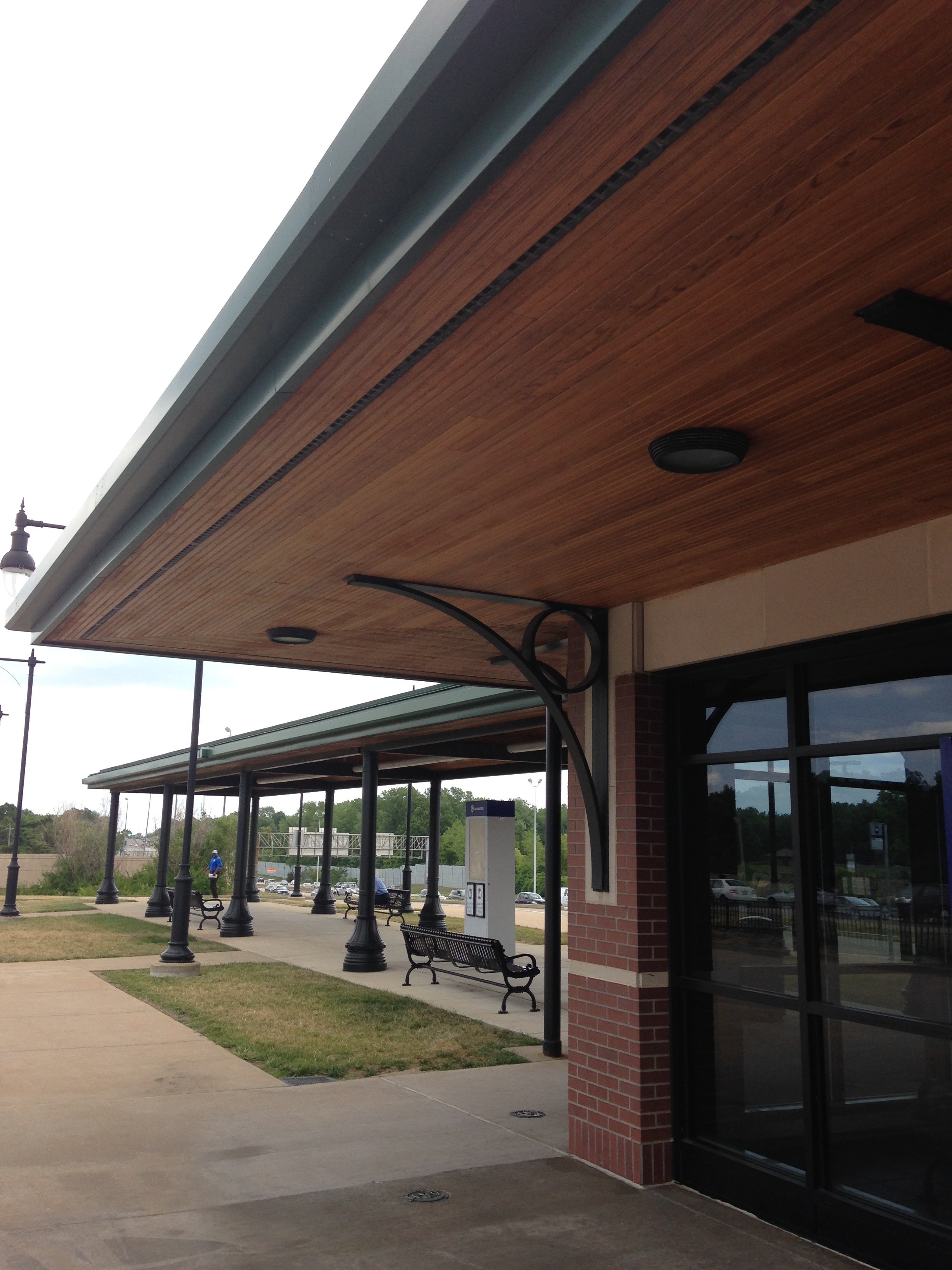
CMT Observations on Stations Visited
Shrewsbury MetroLink Station
- Bigger bus number on bus signs bigger than other stations, but could still be bigger.
- The train platform should have a Metro logo that faces Lansdowne for better visibility from the road.
- Empty Lamar signs are eye sores. Should have filler images when they are empty.
- Ticket Machines need signs, they are never well marked.
- Each bus route needs a map of where it goes. A visual map.
- Could use better directional signage for the bus bay. People waiting by the elevator don’t know what buses they can catch on the other side of the loop.
- Ballards need painting.
- Elevator not working.
- No landscaping, generally unattractive. Dead trees on the sidewalks and in the parking lot.
- Platform and parking need better exit signs. You don’t know which way you should go on the platform or to leave the parking lot.
- Are there call for assistance phones on the platform? How do passengers call in and report emergencies from the platform? Where do they call? Is there any signage for emergencies?
- There could be more benches under the canopy for the amount of people waiting for buses.
- Station could use better pedestrian crossings outside of the station.
- Could be more trash cans and the ones that are there are hard to see. They blend in too much.
- Guards were not very enthused or approachable.
Fairview Heights MetroLink Station
- Signage is faded.
- Lots of old adverts in the different signage options.
- Validators could be more visible. No eye level or overhead signage.
- Glad to see maps of each route in each of the bus bays.
- Hard to see which bus stops at which bay. Should be better marked with overhead signs.
- Whole station needs to be better marked from the street. You don’t know you are at the MetroLink station unless you are turning into it.
- Passenger phones and emergency instructions should be more accessible and visible. Overhead signage.
- Signage at the bus stops not professional.
- The font on the signs are all too small, too hard to see which side you should stand on. Which side goes where.
- Paint chipping on the platform benches.
- Hard to see where to buy tickets from ½ of the parking lot. The other half, you could walk by without even seeing the kiosks. Needs better signage.
- Trash cans blend into the environment. Hard to see where to put trash.
Riverview Transfer Station
- Terrible walkability in and out of the station. No crosswalks, lights or sidewalks that I could see.
- No information in the info box. Overhead signs good.
- Trash cans looked dingy.
- Nice benches.
- Dirty pavement and station.
- Dingy lighting inside.
- No maps for buses in the station.
- Dirty coffee station.
- Inconsistent font and lettering on the signs.
- Women’s bathroom fine, could be nicer, but fine for what it is.
- Security guards present some, but not all of the time we were there.
Rock Road Station
- Terrible pedestrian access to the station. Most direct path out on foot through parking lot. Have to go out of the way to use the sidewalks. Also tough to cross the street across from the station.
- Needs better bus signage. Which buses park where?
- No signs or routes in the bus bays.
- Nice bus shelters.
- Not clear where to buy tickets.
- Concrete on platform in bad shape.
- Needs cross here signs for tracks.
- Lots of trash lying around.
- Where are the passenger assist phones? Where do people call for help if there is an emergency?
- On the platform, hard to see which side goes where?
- Fences around the property broken
Ballas Bus Facility
- Need highway signage. Better branding.
- Doors locked from the inside of the building. Broken exit button. Can’t get out on one side.
- No information in info booth.
- Signs not relevant or effective.
- Metro signs don’t match the décor, or vice versa.
- Beautiful facility.
- No info at bus bays or any info on where the buses are going.
- Need better bus route signage.
- Benches are nice.
- Bicycle racks need painting.
- Landscaping needs help.